“What a piece of work is a man! how noble in reason!
how infinite in faculty! in form and moving how
express and admirable! in action how like an angel!
in apprehension how like a god! the beauty of the
world! the paragon of animals! And yet, to me,
what is this quintessence of dust? man delights not
me: no, nor woman neither...”
First rendering of How Like An Angel for Syndicate Books.
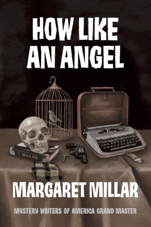
Paul Oliver and I were going over ideas for the Syndicate Books cover of How Like an Angel. One idea was to have a row of monk-like figures walking along with their heads down (the California cult in the book) with the Grim Reaper amongst them, looking up—which we did. But, one of Paul’s suggestions seemed most fitting for this Maggie Millar novel. Since the title came from Hamlet, why not make the art a memento mori painting, referencing the famous moment between William Shakespeare's Danish Prince and the skull of Yorick, but substitute modern (well, closer to mid-twentieth century) elements from the novel? So, that’s what we did.
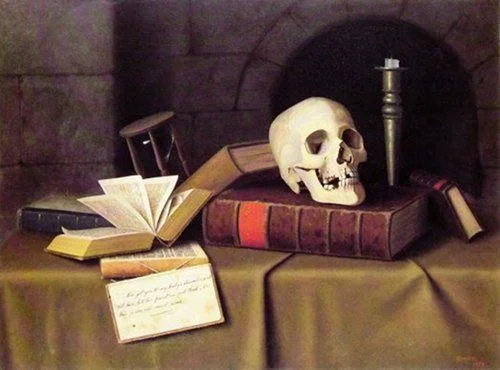
To This Favour by William Michael Harnett, 1879.
Memento mori paintings often include a skull, a book, or a piece of paper draped over the front of the table that the various objects are sitting on. I chose to include the cloth from a relatively famous memento mori painting housed at the Cleveland Museum of Art—William Michael Harnett’s To This Favour from 1879, to help sell the feel.
Full-color version of what would become the finished cover of Syndicate's How Like An Angel.
I draped the yellow and black flannel from the novel at the front of the table in lieu of the typical note. Because I had the opportunity to include a book, I knew as an illustrator/designer, I had to pay homage to the brilliant illustrator/designer, Richard M. Powers, who did the original dust jacket art for the Random House first edition of How Like An Angel. So, we've got a memento mori within the memento mori in a way. As T.S. Eliot first wrote to Ezra Pound, and Warren Zevon to Ken Millar (AKA Ross Macdonald), I repeat to the late Richard Powers: Il miglior fabbro.
Random House first edition of How Like An Angel with original Richard M. Powers cover art.
This cover seemed somewhat out of place compared with the other covers we’ve done up until this point. In an attempt to have it fit in a bit better, I desaturated the art by eighty percent to have it be more in keeping with a number of the more monochromatic covers we’ve created thus far.
The final product.


